


How Autumn Colours Affect Mood and Alter Daily Life
Mixing a seasonal palette, telling stories about colours.

The other day you were still green, just like the other neighbours by the roadside. I don’t usually notice you, except when my gaze occasionally slides over your pale branches while searching for the housekeeper’s pet crow. Now you’re yellowing – highlighting yourself with a familiar neon marker. I don’t know why you want to be noticed, but I see you.
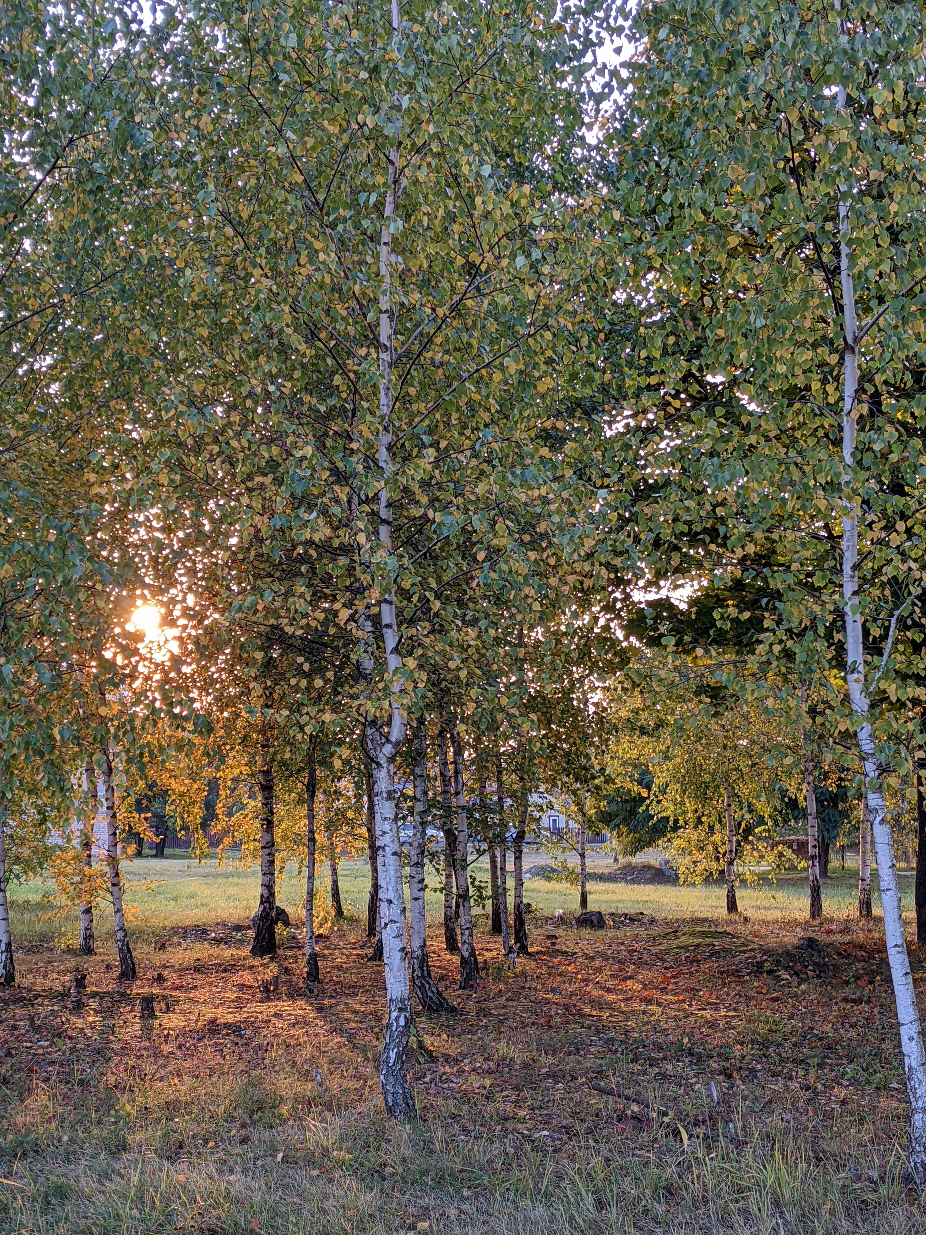
Hi. In August, we went to watch storks gathering in the fields, but instead, we found ripe auksis (for city folk like me, that’s a sweet and juicy variety of autumn apples). The parks this year have also donned coats of crunchy leaves, sun-dried twigs, and other autumn trinkets rather early. Although the maple in the yard is still vibrantly green, the birch beyond the fence, already turning yellow, inspired me to write my first autumn newsletter.


Summer, with its meadows, forests, lakes, gardens, and vases full of colour, is entirely different from the brushstrokes of the now darkening landscape. It's not new to consciously bring this change of colours into your wardrobe or interior, and even unconsciously, it makes you feel a bit different. I'm talking about the romantic warm hues which colour the world in autumn. Let’s set aside seasonal blues for now; we'll talk about them later.
Even if you weren’t searching, you’ve probably come across advice about what colour to wear during a job interview, which colour wallet to buy to attract money, what colour to paint your restless toddler’s room, or what colour dress will capture the eye of that special someone you're attracted to. Colour therapy is also used for medical purposes – to treat anxiety, sleep disorders, post-traumatic stress disorder, and depression. In short, I’m trying to explain that colours matter, so the changing seasonal landscapes – both in nature and in urban areas – are not just a visual affair. It’s a fully physical experience, influencing emotions, behaviour, energy levels, and social habits.

Dried orange, mustard yellow, Bordeaux red from Bordeaux, and ploughed or crusty brown. These are roughly the colours I associate with more autumnal Lithuanian landscapes. I'll get to my autumn colour scheme shortly, but I'm waiting for yours in the comments! What other colours do you associate with this season?
Dried Orange
I don’t believe you always throw away the peel from a freshly eaten orange straight in the bin. Don’t you ever leave it on your desk next to the computer, and maybe only the next day, dried out by the heat from the fan, you finally make yourself throw it?
Orange, located between red and yellow on the colour spectrum, combines the effects of these colours – energy and optimism.
Warm colours, including orange, activate social and problem-solving skills, which might explain why autumn is traditionally considered the start of the academic year.
Long autumn walks – my most anticipated seasonal inevitability. My feet carry me, conversations flow easily, and coat tails flutter in the breeze.
Mustard Yellow
Yellow, in general, is quite an intense colour, often associated with the sun, light, and warmth. Psychologists claim1 that this colour encourages happiness and can even help reduce symptoms of depression. However, intense shades can cause anxiety for some people, so a muted shade, like mustard yellow, could become an optimal preventive measure to improve our moods in autumn. I read that yellow stimulates creativity. I’m not sure if there’s enough evidence of this, but I clearly remember that in my yellow-painted teenage room, I creatively found (with success!) ways to avoid doing my maths and physics homework. You might say, "What does that have to do with the walls?" – well, that’s exactly what I needed: an explanation. The walls!
Do you like mustard? I still don’t understand it – wherever I add it, it ruins the taste. The only exception is the classic salad dressing made from honey, lemon juice, good olive oil, and a teaspoon of Dijon mustard. But I suspect I add it out of habit and for aesthetics. If you have a recipe or advice on what mustard genuinely tastes good with (if that’s even possible), let me know in the comments.
Bordeaux from Bordeaux
Code, I hope, deciphered. Apologies to my body and my efforts to live a healthier lifestyle, but in every season in Italy and autumn in Lithuania, wine flows freely.
Red is one of the most intense colours in our environment. It triggers immediate physiological reactions, such as increased heart rate, elevated body temperature, and a surge of adrenaline. We instinctively associate red with danger or signals requiring urgent attention. This colour can help change habits, for example, by encouraging a more active lifestyle. By the way, when we see red, whether literally or figuratively, we're more likely to remember the events tied to that moment.
The Bordeaux shade is deeper, often linked to passion, love, and the emotional world in general. I’ve heard it said that people fall in love most easily in spring, but maybe it’s those burgundy maple leaves, or more likely, the freely flowing wine, that makes autumn my personal season of love.
Ploughed or Crusty Brown
Earth tones are often associated with stability and security. In psychology, brown is frequently linked to reliability and endurance; it can help us feel more grounded and stable, especially during stressful situations. Emotionally, brown creates a sense of warmth and cosiness.
This colour is often chosen for work environments as it promotes diligence, responsibility, and helps maintain focus and consistency. The autumn landscape can be the perfect visual background for intellectual activity.
One might think this is quite a dull colour, but it’s important to remember its stabilising and calming effects. Very soon, we will be consistently calm, grounded, and assured that no other colour will break through until the spring begins drying the layers of mud away.
Scientists claim that in autumn, when warm tones dominate the surroundings, we often feel more energetic than when surrounded by cool tones. The autumn palette can help in overcoming daily challenges, making us feel stronger and more confident. Cool colours, like blue and grey, are known to be calm and relaxed. Though less common in autumn, these colours can still be found in nature and may help maintain emotional balance. And just when everything seems so logical and natural, episodes of seasonal melancholy roll in.
The main cause of seasonal affective disorder (SAD) is the lack of natural light, which disrupts the circadian rhythm and lowers serotonin levels in the brain. While the autumn colours in nature, wardrobes, and seasonal interior details can help combat these symptoms, unfortunately, they cannot entirely neutralise the lack of natural light.


One effective way to resist melancholy moods and benefit from the power of colours is not only to spend time in autumnal nature, but also to visit art exhibitions. Studies show that observing art can significantly improve one’s mood, reduce stress, and even aid in treating depression. Art exhibitions and events are a great way to further enrich daily life. This autumn, I invite you to actively look for ways that colours can improve the quality of your life.
If you lack ideas on where to go or what to see in Lithuania, you’ll find some options in the text I wrote a few weeks ago. And if you lack time to see everything, subscribe – I’ll show you.
See you soon,
Galerista
All horoscope like statements psychologists say, science has proven, scientists say, research shows, etc. in this text is based on several online sources that I share here:
I associate deep browns and yellows with Autumn, nothing new there really. Have to disagree with you about mustard though, yummy!